Behavior Panel UIm
The behavior panel is defined via json with the following basic pattern.
{
"grid": {
    "columns": 12, // 12 or 16 are reasonable, go nuts tho
    "rows": 6 // 6 is the recommended height for visual consistency
    },
    "components": [
        // list of the components
    ]
}
Components
Each component will broadly be in the following form
{
    "id": "some-unique-identifier",
    "type": "text" | "button" | "dropdown" | "input", // One of these values, defining the element to be shown.
    "position": { // The position of the element in the grid, in units of grid squares
        "column": 1, // 1-indexed column from top
        "row": 1, // 1-indexed column from left
        "width": 1, // The number of grid cells wide
        "height": 1// The number of grid cells tall
    },
    "properties": { // Values that define the visuals of the element
        // Contents depends on the specified type
    },
    "action" { // Values that define the behavior triggered by the element
        "callback": "function_callback", // The function that will be called when triggering the behavior
        "type": "string" | "int" | "double", // The data type that will be sent in the OneOfTypeCallback
        "value": ,// contents depends on the specified type (both the action type and component type)
    }
}
info
For serial you will want to fill the callback field as write_serial(port) (for example, write_serial(/dev/ttyUSB0)). If you need to trigger more advanced behaviors, follow the guide to create and register custom functions.
Text
{
    "properties": {
        "text": "Text that shows in the specified area",
    },
    // No action for text
}
Button
{
    "properties": {
        "text": "Text that shows up on the button",
        "color": "primary" | "secondary" | "tertiary" | "accent" | "warning", // The color of the button
        "tooltip": "Text that shows when hovering over the button (optional)"
    },
    "action": {
        "callback": "function_callback", // The registered function called when the button is clicked
        "type": "string" | "int" | "double", // Value data type
        "value": "test" | 5 | 8.2 // One value matching the action type that will be sent when the button is clicked.
    }
}
Dropdown
{
    "properties": {
        // Note, either provide a placeholder OR a defaultValue, not both
        "placeholder": "Select mode", // Text that will show up if no value is selected
        "defaultValue": "value1", // The selected start value matching one of the option's values
        "tooltip": "Text that shows when hovering over the dropdown (optional)"
    },
    "action": {
        "callback": "function_callback", // The registered function called when send is clicked
        "type": "string" | "int" | "double", // Value data type
        "options": [ // List of dropdown options
            {
                "label": "Label 1", // The text that will show up in the dropdown
                "value": "value1" // Must match the action type
            },
            {
                "label": "Label 2",
                "value": "value2"
            },
            {
                "label": "Label 3",
                "value": "value3"
            }
        ]
    }
}
Input
{

    "properties": {
        // Note, you can provide any combination of placeholder and defaultValue
        "placeholder": "Text that shows when no value in input (optional)",
        "defaultValue": "Starting value within the input field (optional)",
        "tooltip": "Text that shows when hovering over the dropdown (optional)"
    },
    "action": {
        "callback": "function_callback", // The registered function called when send is clicked
        "type": "string" | "int" | "double", // Value data type
    }
}
Example
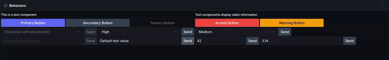
Which is generated from the following JSON.
{
    "grid": {
        "columns": 12,
        "rows": 6
    },
    "components": [
        {
            "id": "simple-text",
            "type": "text",
            "position": {
                "column": 1,
                "row": 1,
                "width": 6,
                "height": 1
            },
            "properties": {
                "text": "This is a text component"
            }
        },
        {
            "id": "longer-text",
            "type": "text",
            "position": {
                "column": 7,
                "row": 1,
                "width": 6,
                "height": 1
            },
            "properties": {
                "text": "Text components display static information"
            }
        },
        {
            "id": "primary-button",
            "type": "button",
            "position": {
                "column": 1,
                "row": 2,
                "width": 2,
                "height": 1
            },
            "properties": {
                "text": "Primary Button",
                "color": "primary",
                "tooltip": "This button has a tooltip"
            },
            "action": {
                "callback": "button_callback",
                "type": "string",
                "value": "primary"
            }
        },
        {
            "id": "secondary-button",
            "type": "button",
            "position": {
                "column": 3,
                "row": 2,
                "width": 2,
                "height": 1
            },
            "properties": {
                "text": "Secondary Button",
                "color": "secondary"
            },
            "action": {
                "callback": "button_callback",
                "type": "int",
                "value": 2
            }
        },
        {
            "id": "tertiary-button",
            "type": "button",
            "position": {
                "column": 5,
                "row": 2,
                "width": 2,
                "height": 1
            },
            "properties": {
                "text": "Tertiary Button",
                "color": "tertiary"
            },
            "action": {
                "callback": "button_callback",
                "type": "double",
                "value": 3.0
            }
        },
        {
            "id": "accent-button",
            "type": "button",
            "position": {
                "column": 7,
                "row": 2,
                "width": 2,
                "height": 1
            },
            "properties": {
                "text": "Accent Button",
                "color": "accent"
            },
            "action": {
                "callback": "write_serial(/dev/ttyUSB0)",
                "type": "string",
                "value": "serial_data"
            }
        },
        {
            "id": "warning-button",
            "type": "button",
            "position": {
                "column": 9,
                "row": 2,
                "width": 2,
                "height": 1
            },
            "properties": {
                "text": "Warning Button",
                "color": "warning",
                "tooltip": "Warning style button"
            },
            "action": {
                "callback": "button_callback",
                "type": "string",
                "value": "warning"
            }
        },
        {
            "id": "placeholder-dropdown",
            "type": "dropdown",
            "position": {
                "column": 1,
                "row": 3,
                "width": 3,
                "height": 1
            },
            "properties": {
                "placeholder": "Dropdown with placeholder",
                "tooltip": "This dropdown shows a placeholder"
            },
            "action": {
                "callback": "dropdown_callback",
                "type": "string",
                "options": [
                    {
                        "label": "Option 1",
                        "value": "option1"
                    },
                    {
                        "label": "Option 2",
                        "value": "option2"
                    }
                ]
            }
        },
        {
            "id": "default-dropdown",
            "type": "dropdown",
            "position": {
                "column": 4,
                "row": 3,
                "width": 3,
                "height": 1
            },
            "properties": {
                "defaultValue": 100
            },
            "action": {
                "callback": "dropdown_callback",
                "type": "int",
                "options": [
                    {
                        "label": "Low",
                        "value": 50
                    },
                    {
                        "label": "High",
                        "value": 100
                    }
                ]
            }
        },
        {
            "id": "double-dropdown",
            "type": "dropdown",
            "position": {
                "column": 7,
                "row": 3,
                "width": 3,
                "height": 1
            },
            "properties": {
                "defaultValue": 2.5,
                "tooltip": "Dropdown with double values"
            },
            "action": {
                "callback": "dropdown_callback",
                "type": "double",
                "options": [
                    {
                        "label": "Small",
                        "value": 1.5
                    },
                    {
                        "label": "Medium",
                        "value": 2.5
                    },
                    {
                        "label": "Large",
                        "value": 3.7
                    }
                ]
            }
        },
        {
            "id": "placeholder-input",
            "type": "input",
            "position": {
                "column": 1,
                "row": 4,
                "width": 3,
                "height": 1
            },
            "properties": {
                "placeholder": "Input with placeholder"
            },
            "action": {
                "callback": "input_callback",
                "type": "string"
            }
        },
        {
            "id": "default-input",
            "type": "input",
            "position": {
                "column": 4,
                "row": 4,
                "width": 3,
                "height": 1
            },
            "properties": {
                "defaultValue": "Default text value"
            },
            "action": {
                "callback": "input_callback",
                "type": "string"
            }
        },
        {
            "id": "int-input",
            "type": "input",
            "position": {
                "column": 7,
                "row": 4,
                "width": 2,
                "height": 1
            },
            "properties": {
                "defaultValue": 42
            },
            "action": {
                "callback": "input_callback",
                "type": "int"
            }
        },
        {
            "id": "double-input",
            "type": "input",
            "position": {
                "column": 9,
                "row": 4,
                "width": 3,
                "height": 1
            },
            "properties": {
                "placeholder": "Double input",
                "defaultValue": 3.14,
                "tooltip": "Input for decimal numbers"
            },
            "action": {
                "callback": "input_callback",
                "type": "double"
            }
        }
    ]
}